5 Reasons Why We Redesigned Our Website (And Why You Should)

Share This Article
Table of Contents
Subscribe to Our Blog
We're committed to your privacy. SayOne uses the information you provide to us to contact you about our relevant content, products, and services. check out our privacy policy.
A website is a golden feather in your online presence. It replicates your brand values and creates the first impression among prospective customers. However, just having a website there is not going to work.
Your website has to offer an enjoyable experience to the users. An outdated and complex website is the last thing that you want to offer them. A website redesign is the best way to update your online presence in accordance with the latest trends. Many of us refrain from taking it up thinking about the bottlenecks. But having a checklist can be really useful for the successful execution of a website redesign plan.
After being part of a website redesign marathon, I have decided to share my experience here in this blog.
Read more: How AI-based UX will be the future of customer experience
Reasons to redesign our existing website
To increase user engagement and conversion rates
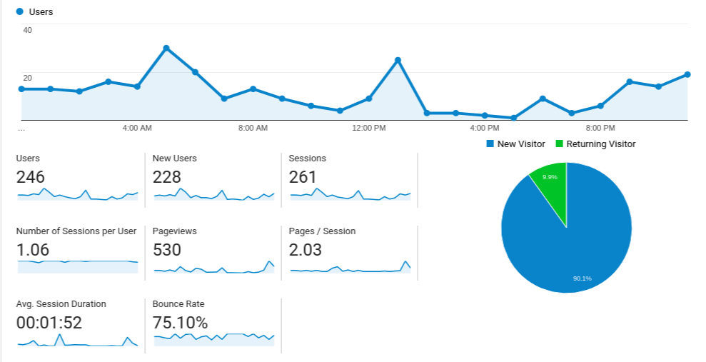
We seldom faced the issue of having fewer users to the website. In fact, we had close to 250 new users on our website every day. The good news was that most of these visitors belonged to our sweet spot.
Check out the screenshot below:

If things were good back then, then why did we think about a website redesign? Well, here is the answer. While this was happening, we had a lot of expectations. A contact page that had 808 visitors monthly was bound to get at least 10 business inquiries on a weekly basis.
But the sad truth was that it wasn’t happening.
There were months when we got less or no inbound business inquiries despite having a significant website traffic. Also, we spotted a high bounce rate for the website which indicated that most of our visitors dropped off after a single page visit.
These data points indicated that there were some major gaps in our website. We understood that it could not be solved by redesigning a single page or optimizing the contact page alone. Rather, the user’s journey had to be tailored from the scratch for effective conversion.
Download Now: Development process for the layperson and what does it take to build an application
To improve SEO and website performance
We expected the magic to happen on its own. And it did happen for quite a long time.
Our quality-rich content materials did the job quite well and showed up in the first pages of search results. Our blog parameterization using JMeter is still one of the most visited pages.
We were doing good for about 1-2 years. Then, the magic started fading gradually.
As more updates were introduced by Google, we saw a significant decrease in organic search results. A recent SEO audit indicated that some of our web pages were not in-line with the new SEO updates.
A fundamental shift in the page structure felt necessary. On a code level basis, we found it rather hard to implement new SEO tactics like structured data markup, open graph protocol tags, and mobile optimization enhancements.
This prompted us to articulate a seamless website journey in alignment with our Digital Marketing initiatives.
To be the voice of our customers
Your website should reflect your brand values. A website strengthens our online presence and communicates with our prospective customers. Hence, it is essential to ensure that both your website and business representatives express the same message everywhere.
In this league, we wanted to be the voice that our customers want to listen to. The process of active listening can easily tell us about the customers’ problems and needs.
As their demands and needs keep evolving, there is a critical need to tweak our message, such that we communicate in a manner that they understand and prefer. To accomplish this, we created a new content strategy that resonates with our business values and customer demands.
This new content strategy required the addition of a few elements to the website and major changes in the content flow.
To adapt the changing design and UI trends
Our old website structure was designed and developed a few years back. Since then, we had brought about minor design modifications without many transformations in the existing layout.
After about 2 years, we felt that it looked outdated. Our new website had to look more welcoming and visually pleasing. And we already had the in-house resources to create a kick-ass website layout and then, develop it using niche technologies. Their experience and expertise in this domain boosted our confidence.
To create a seamless and delightful experience for our users
User experience is the key to online success. The purpose of a website is mainly to attract the visitors and convert them to leads.
If users find your online portals to be intuitive and simple to use, then you are bound to get a lot more loyal users and generate more inbound inquiries.
Our old website structure was a bit complex. There was an opportunity to make it better and engaging and we jumped at it. We finalized on a website that was visually pleasing as well as easy to navigate.
The goal was to create an enjoyable experience for our users.
How did we design an SEO-friendly website?

Redesigning your website can be an SEO nightmare. So, how did we accomplish this task?
- A well-defined website redesigning strategy
We had a clear-cut idea about our needs. The new website had to maintain the existing traffic, reduce bounce rate, and increase conversion rates.
The content for the revamped website was prepared and debated upon to align with our brand values. Further, we divided the website redesigning plan into two phases: Phase 1 and Phase 2.
In phase 1, we planned to implement all the necessities that made the website fool-proof from technical and SEO standpoints. Phase 2 included details of all the niceties to improve performance.
- The right set of team
Revamping an existing website to be SEO-friendly requires a team who has a fair knowledge of the various SEO elements. A solid team with SEO understanding could easily save time and trigger the progress.
Our team consisted of designers, developers, digital marketing experts, and experienced project managers. From ideation to implementation, all of us collaborated and brainstormed together to realize the objectives.
Every minute update was communicated to the whole team. This ensured that everyone working on the project was on the page at all times.
- Agile project management
An internal project can be often set loose and dealt with less priority. As the new website marked the beginning of a major milestone, we followed the best Agile practices to keep up the pace.
The digital marketing world is ever-evolving. There were updates happening every now and then. This meant that we had to keep our eyes and ears open to pick up anything new that could impact or benefit our plans.
New ideas could be generated during any phase of the project execution. Our parallel sprint execution model helped us to accommodate new requirements that came by as we progressed. An interactive planning and feedback loop speeded up the processes and fastened the time-to-market.
- SEO improvements
SEO has come a long way from the past few years. Thus, we did not want to use the same old techniques. In fact, our emphasis was on the betterment of every element in the website, be it the design, content, functionality or SEO elements.
We brought about certain code modifications such as CSS and JavaScript minification to improve page speed. Structured data markup was introduced in the HTML code to create more visibility in the search results.
Mobile-first indexing update by Google was one of our top priorities. We considered the mobile version to be our primary website version for this cause. We prioritized mobile page speed, loading time, and responsitivity during the development phase.
Download Now: Development process for the layperson and what does it take to build an application [Get Your Copy]
- Pre-launch SEO steps
There is nothing better than having a checklist handy. A pre-launch checklist with details of critical SEO to-do’s was prepared to ensure that we did not miss anything.
In this regard, an audit report of the old website was also captured and saved for comparative analysis. Another vital factor was to do a complete pre-launch audit of the website in staging mode.
From an SEO perspective, missing URLs and 404 pages could prove to be disastrous. Likewise, we could not risk anything that affected our website’s existing rankings.
Hence, we conducted full-fledged reviews of analytics, technical elements, links, contents, and performance aspects of the website prior to the launch. This helped us to identify the gaps and resolve it before it was late.
- Post-launch SEO steps
Once your revamped website is launched, it doesn’t end there. For us, the purpose of the new website was clear - more conversion rates. And every data point matters.
From the very time the redesigned website was launched, we have been closely monitoring the difference in website traffic. Any change in traffic, users, or bounce rate etc can tell us exactly what went right and wrong. Simultaneously, we are working on our phase 2 updations for the websites.
Read more: What is Artificial Intelligence Marketing & Why is it game-changing
The Results

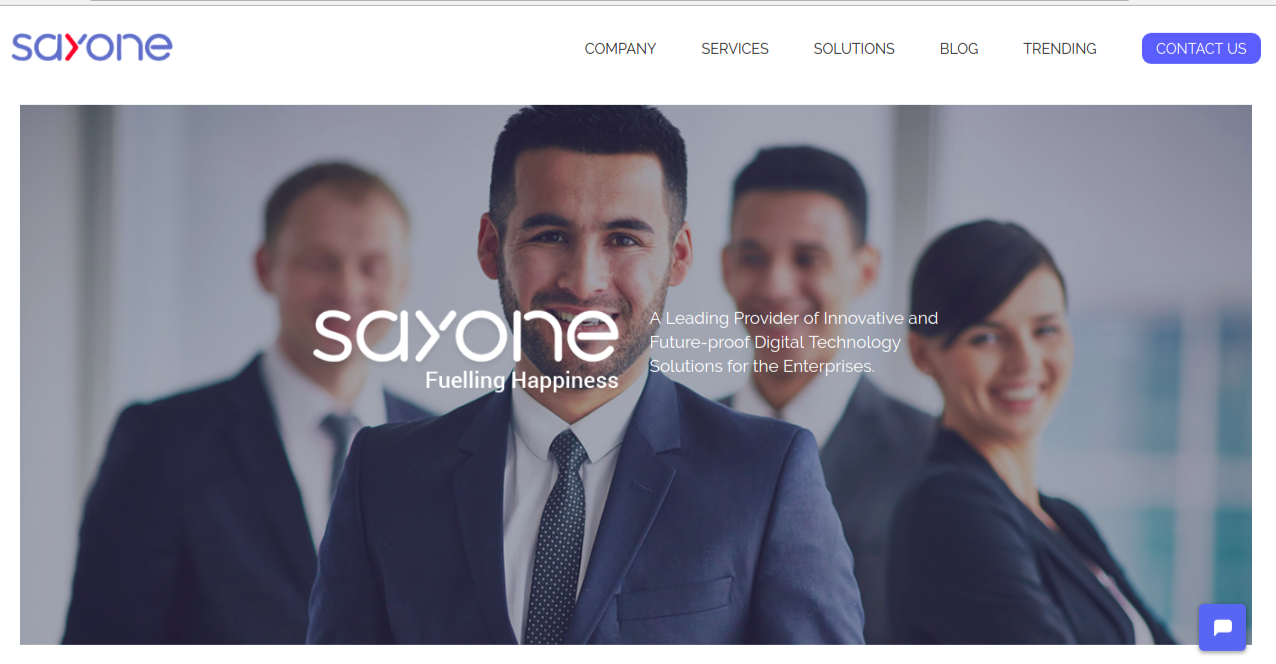
Finally, we have our new SayOne website ready! All those months of planning and hard work are now out in the public. And we are just too happy to contain our excitement.
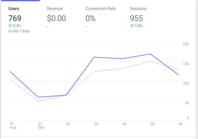
So, has it really been worth the effort? Although we are still in a nascent stage to reach a conclusion, we are seeing some major improvements already. See the screenshot below:

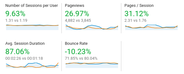
We have had a significant 10% increase in the number of users and sessions. When compared with the previous month’s data, these were the results:

After the initial analysis, we can confidently say that our decision to redesign the website was on point. Ideally, every business should revamp their website after every 2-3 years. I cannot guarantee you that it's going to be a silver bullet in a single shot. However, you can definitely win over in time with the right planning and approach.
If you want to further know about the nuances of our website redesign strategy or need some help with website redesigning, feel free to speak with us. We know the potholes and have been through it. So, we can help you better than anyone!
SayOne has been creating website and mobile application since 2011, and after delivering 400+ projects we know what it takes to crate a successful software product that improves buinsess. Get in touch for a FREE consulation.
Share This Article
Subscribe to Our Blog
We're committed to your privacy. SayOne uses the information you provide to us to contact you about our relevant content, products, and services. check out our privacy policy.


